Designing a data-driven dashboard for e-commerce returns
From an ignored screen to the product’s activation feature
When I joined, the dashboard had been built by developers without user research. It showed data like CO₂ savings and pending exchanges — metrics that looked impressive but had no impact on how brands actually managed their returns. The bounce rate was 80%. Brands were logging in, seeing nothing useful, and leaving.
Context
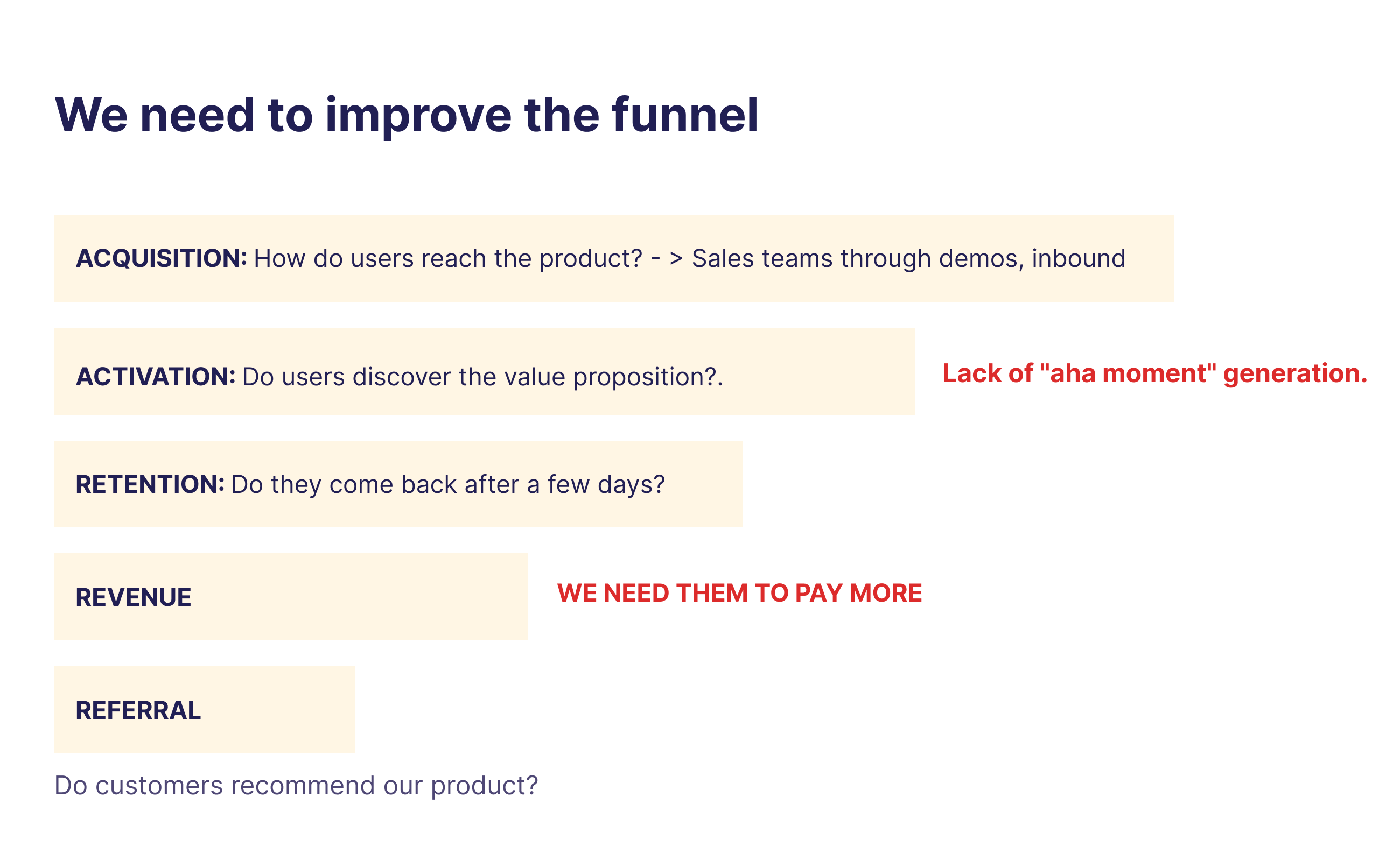
The startup was in a critical phase of market adjustment in 2023, searching for product-market fit and needing to drive growth in both traction and revenue. The AARRR funnel analysis revealed a clear gap at the activation stage: users were reaching the product through sales demos, but they weren't discovering the value proposition. There was no "aha moment."
At the revenue level, the company needed brands to pay more. And at the operational level, over 200 brands were using the service, with 70% requiring returns data — but they couldn't access it themselves. Every report had to be manually requested through Customer Success, which meant developer intervention and constant delays.
Before I Joined (2020–2021)
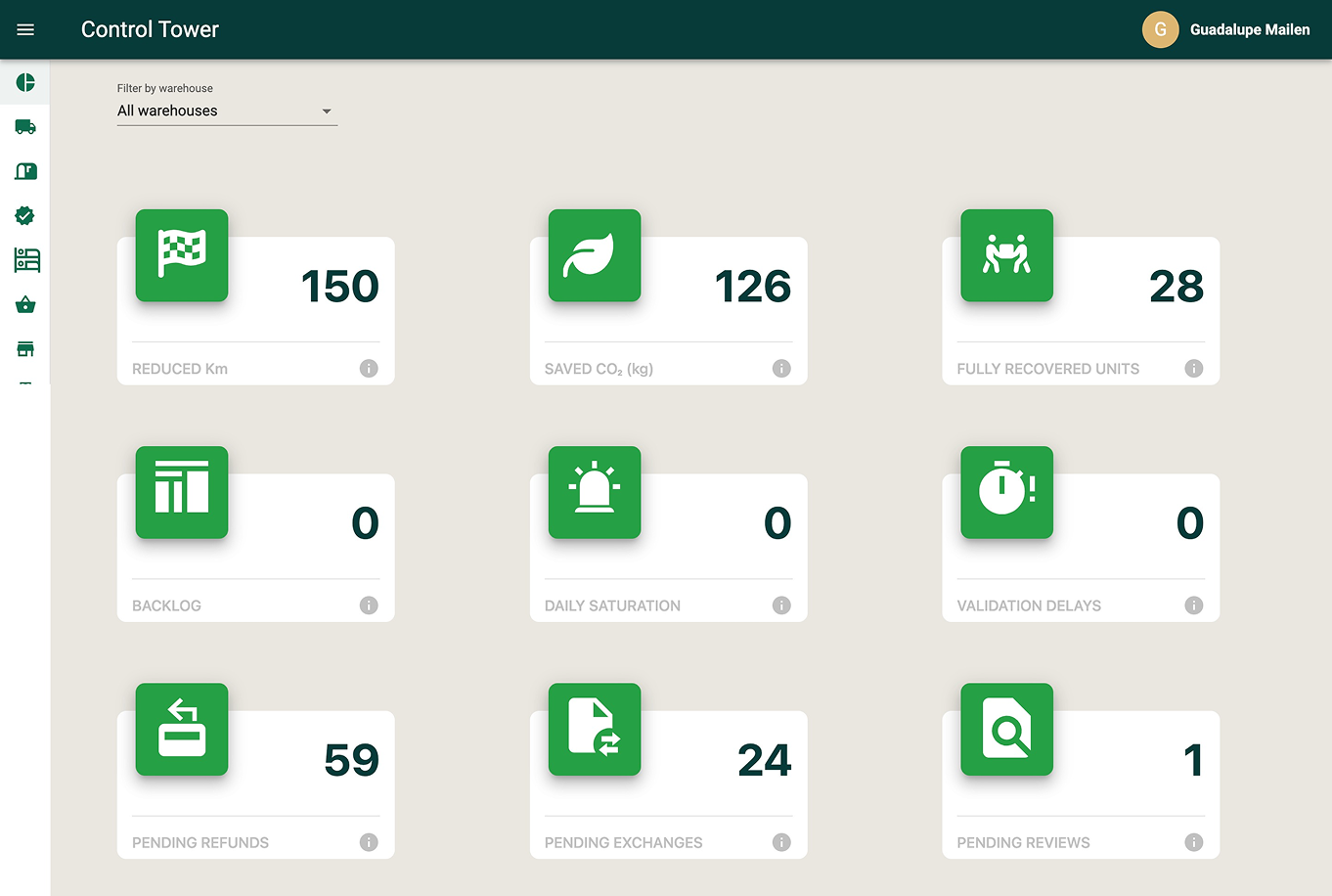
The original dashboard was a "Control Tower" built entirely on stakeholder feedback, not research. It displayed nine metric cards — reduced kilometers, saved CO₂, fully recovered units, backlog, daily saturation, validation delays, pending refunds, pending exchanges, and pending reviews.
The problem: none of these metrics helped brands make decisions about their returns. The data was based on what the company thought was interesting, not what users actually needed.
Discovery
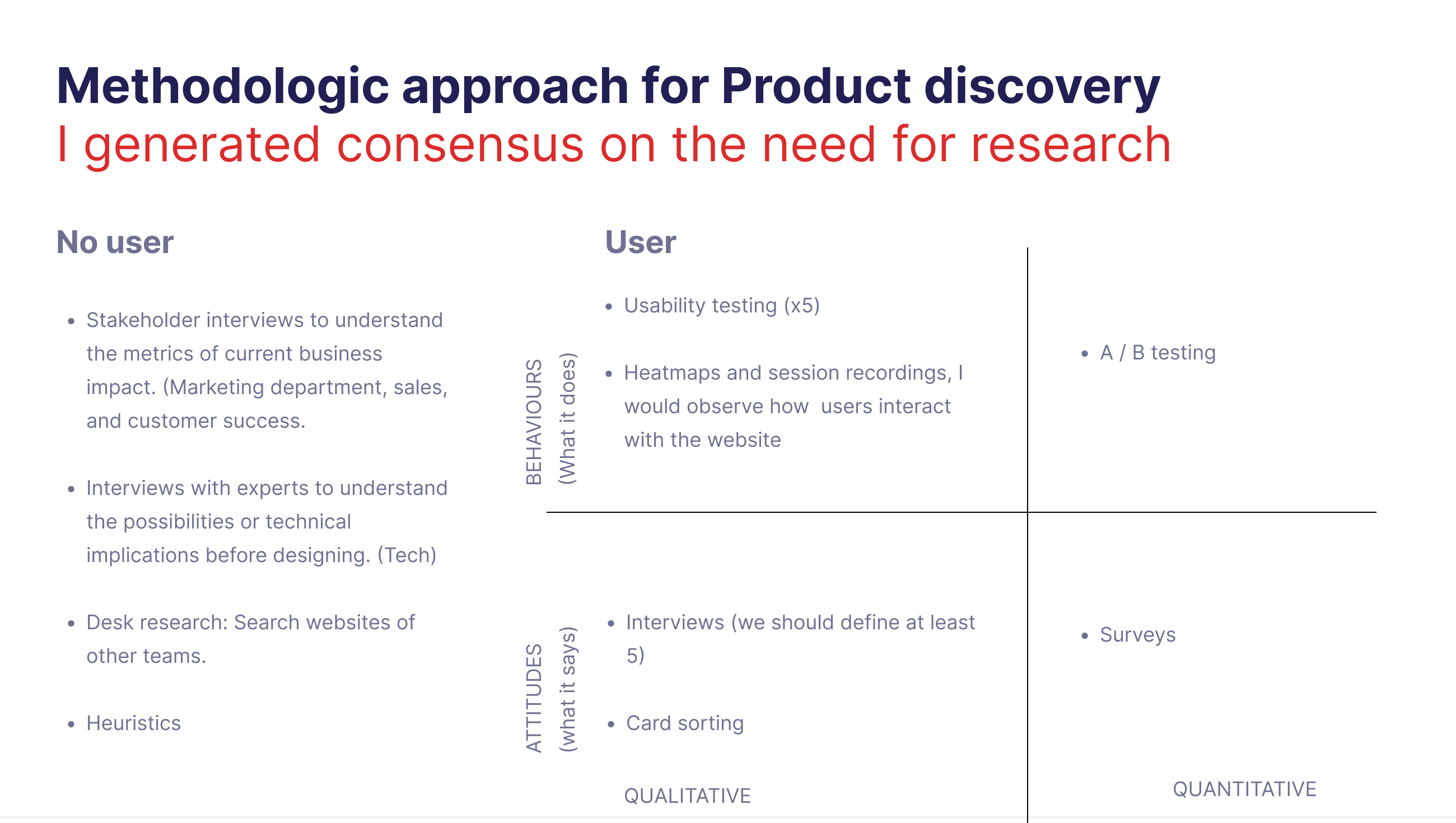
In 2023, I led a proper product discovery process. First, I had to generate consensus within the team on the need for user research — the company had never done it before.
Research approach
Without direct users, I conducted stakeholder interviews with marketing, sales, and customer success teams to understand business metrics and impact. I ran expert interviews with the tech team to understand technical constraints before designing. Desk research covered competitor dashboards and data visualization best practices. Heuristic evaluations identified usability issues in the existing product.
With users, I ran 5 usability testing sessions with heatmaps and session recordings to observe real behavior. I conducted user interviews and card sorting exercises to understand mental models. A/B testing validated design decisions with data. Surveys captured quantitative feedback at scale.
Design process
We conducted interviews with key brands, competitor analysis, and data visualization research. We analyzed metrics to understand the current situation. We designed wireframes and conducted internal workshops to understand the vision and roadmap.
Key findings
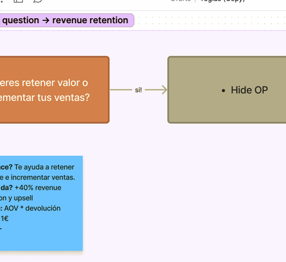
Brands need data on retained revenue and rapid detection of garment manufacturing faults. They want the ability to download data for generating detailed reports. They need to quickly and effectively acquire customer feedback. And they struggle when Customer Success provides reports in CSV format — they want visual, self-service data.
Problems identified
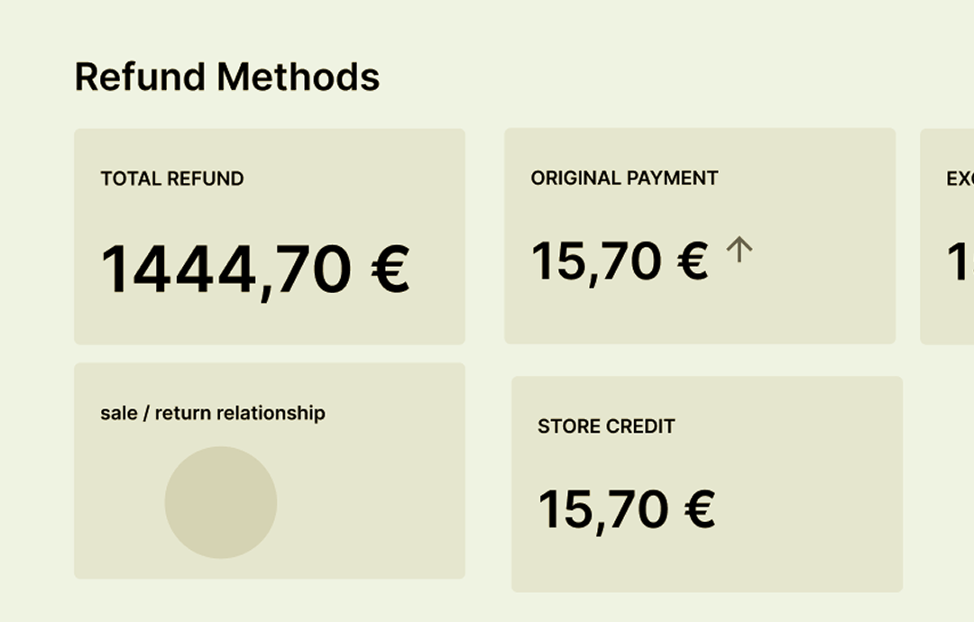
More than 200 users relied on the service, and 70% needed data on returns. But there was no automation — brands had to request data through Customer Success, causing manual work for the development team and delays. The company was losing potential customers during sales demos due to limited data accessibility. And brands still had more refunds than exchanges.
First Iteration
Based on the research, we decided to build two separate dashboards addressing different user needs. In collaboration with the development team, we agreed to implement only bar and line charts in the first MVP to ensure speed of delivery.
Client Dashboard
Focused on business outcomes: transport control, revenue retained, and customer feedback (NPS).
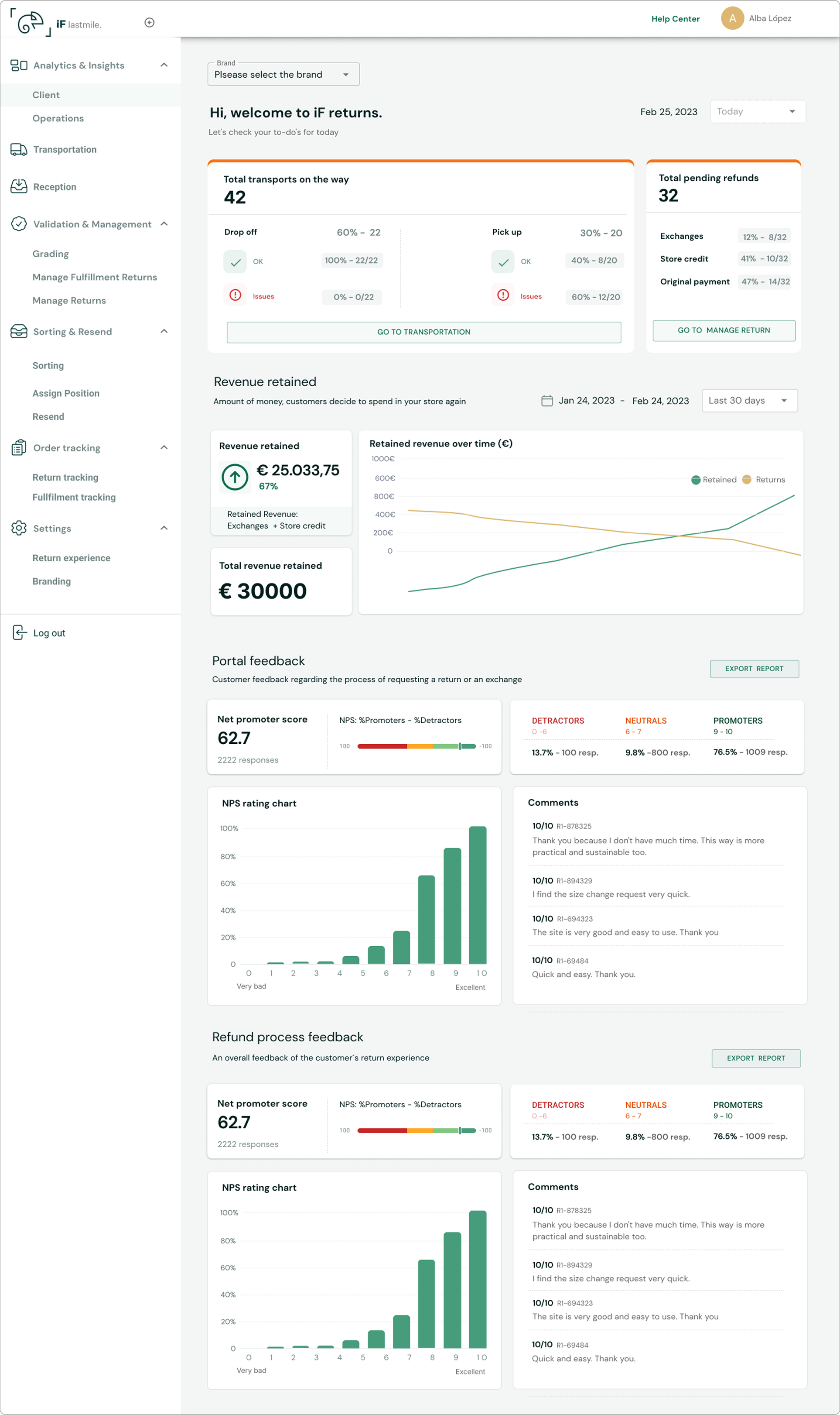
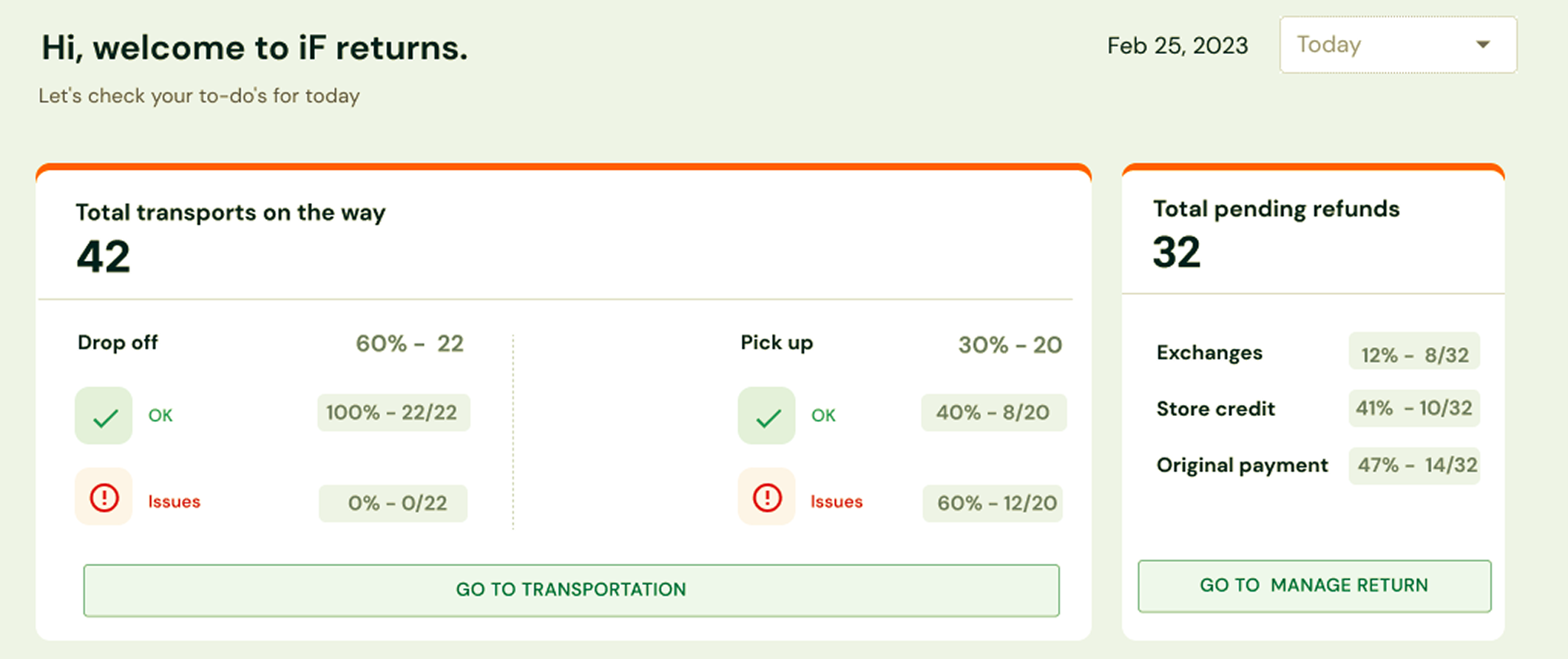
Transport & Refunds Overview — a daily snapshot showing total transports on the way (split by drop-off vs. pickup with incident ratios) and total pending refunds (broken down by exchanges, store credit, and original payment). This gave brands an at-a-glance view of their most urgent operational items.
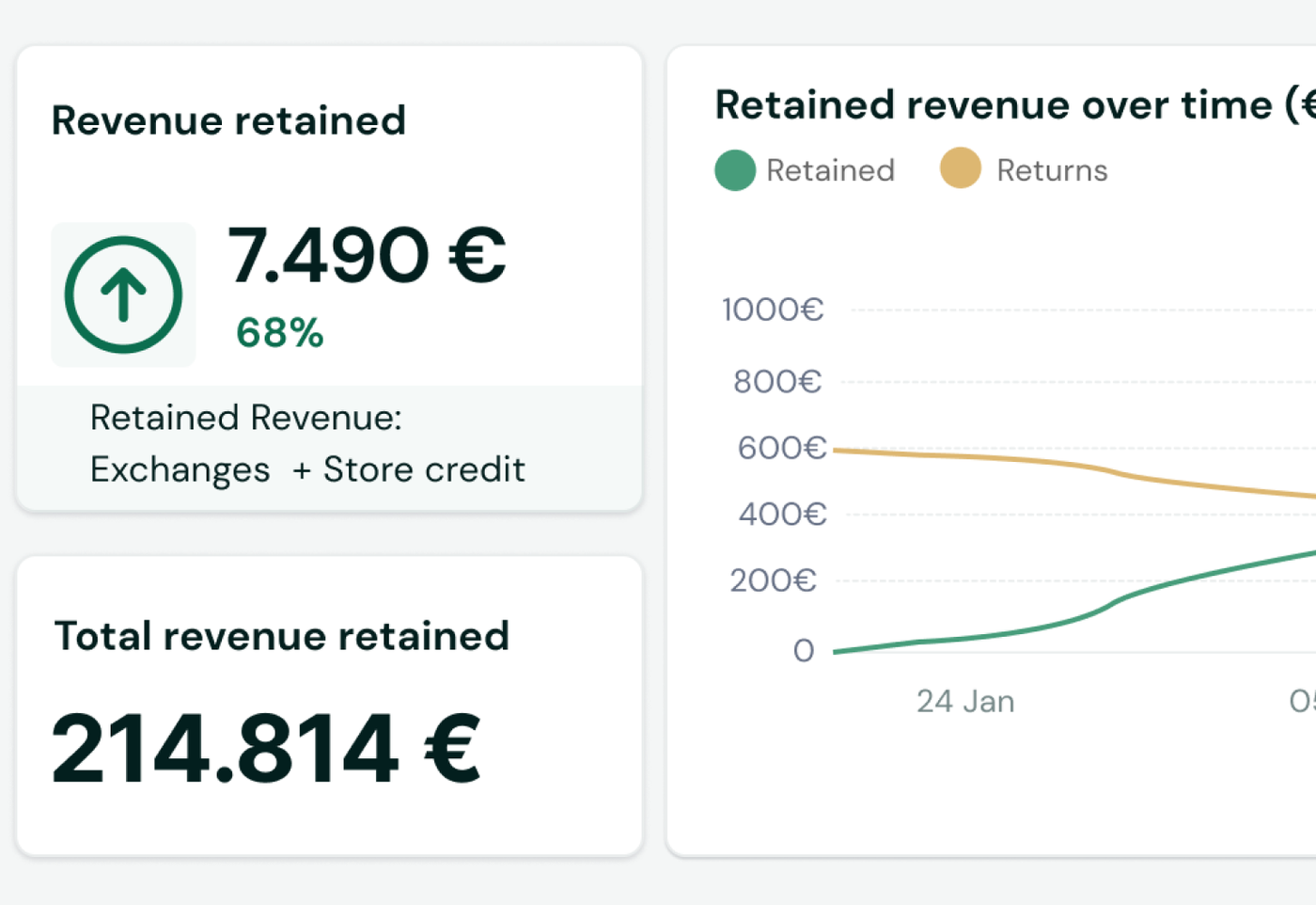
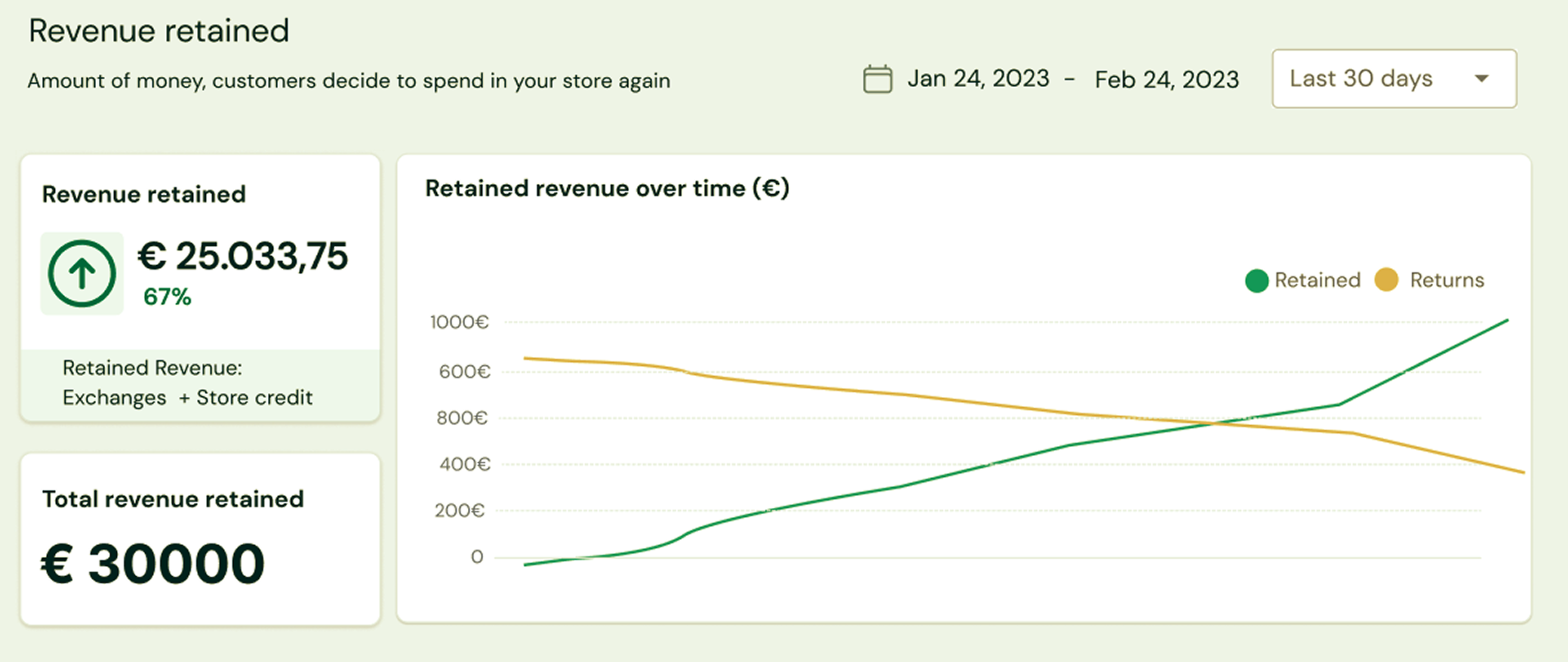
Revenue Retained — information on the total value retained by the platform (sum of exchanges and store credits). Brands can check current values and historical trends, with a graph showing the variation of returns by method over time. Time range filters let them analyze specific periods.
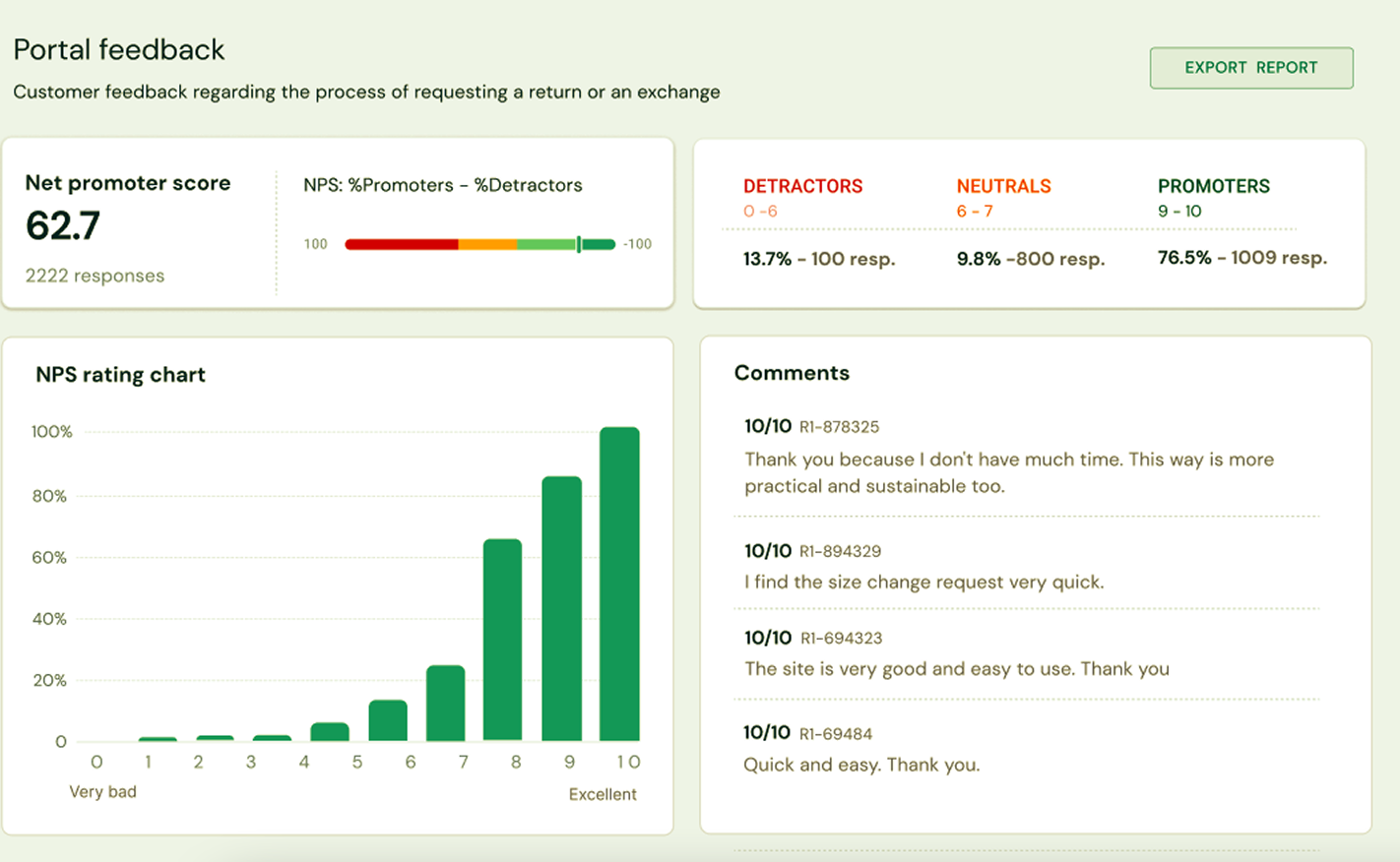
Customer Feedback (NPS) — portal satisfaction scores using Net Promoter Score, with a rating distribution chart and individual customer comments. This gave brands direct visibility into how their customers experienced the return process — without waiting for a report from Customer Success.
Operations Dashboard
Focused on operational insights for internal teams and advanced brand users.
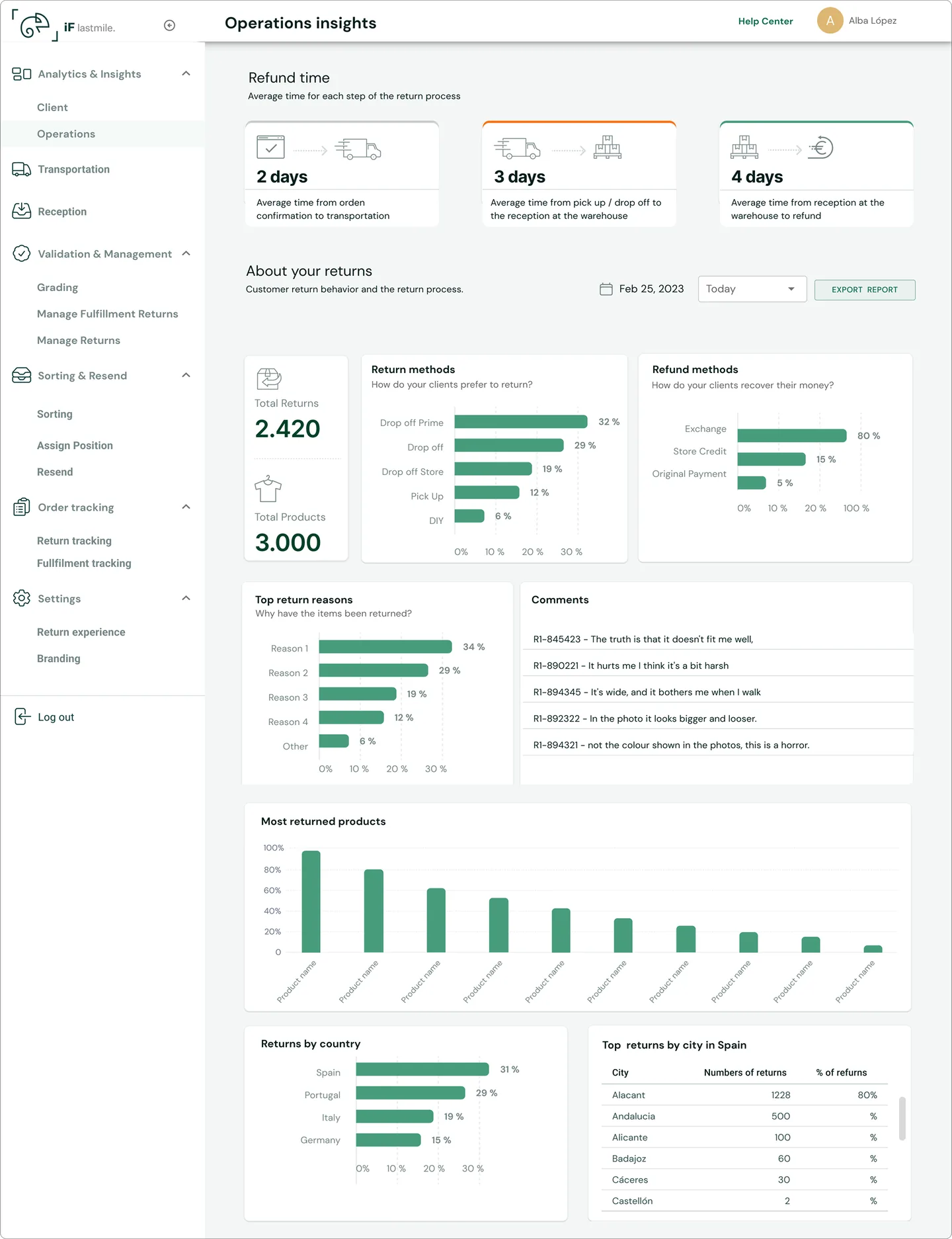
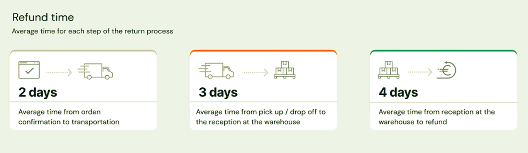
Refund Times — average processing times for each stage of the return: 2 days from order confirmation to transportation, 3 days from pickup/drop-off to warehouse reception, 4 days from reception to refund. This helped brands identify bottlenecks in their return pipeline.
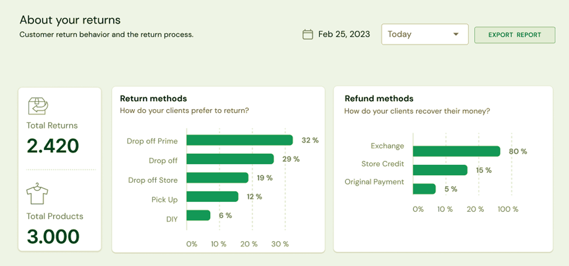
About the Returns — operational data including total returns, total products, most used return methods, and refund method distribution. The top 5 return reasons and customer comments gave brands actionable insights to improve their products and sizing guides.
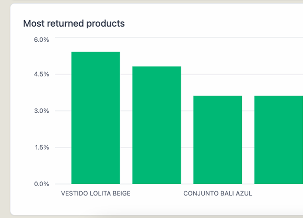
Most Returned Products — a chart showing which specific products had the highest return rates, allowing brands to identify manufacturing issues or misleading product photos.
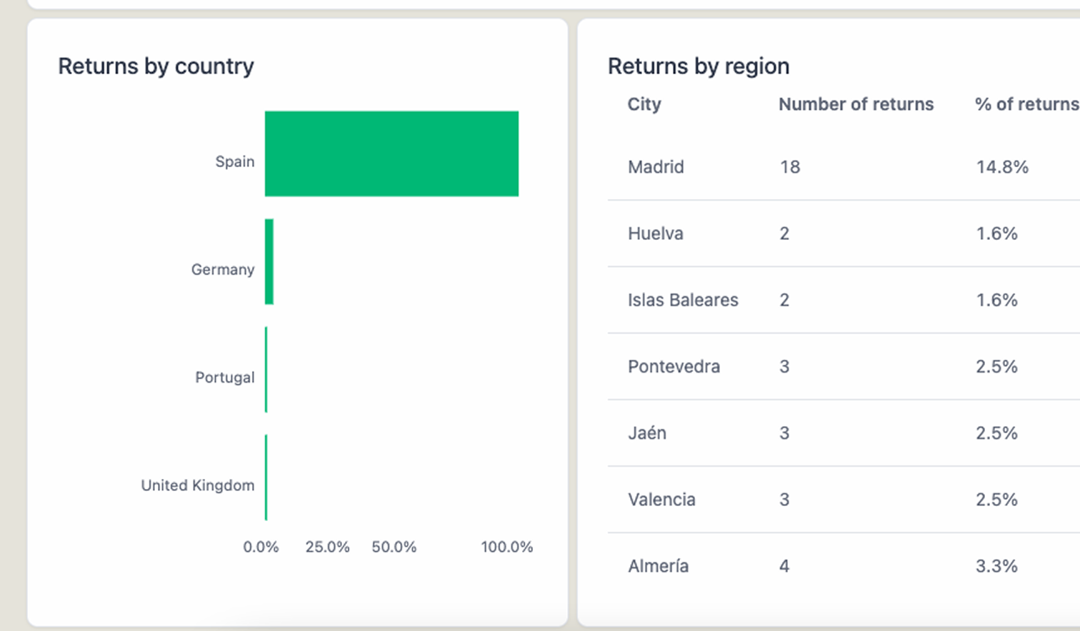
Returns by Geography — breakdowns by country and region, relevant for brands selling internationally to optimize transportation automation and pricing configuration.
Second Iteration
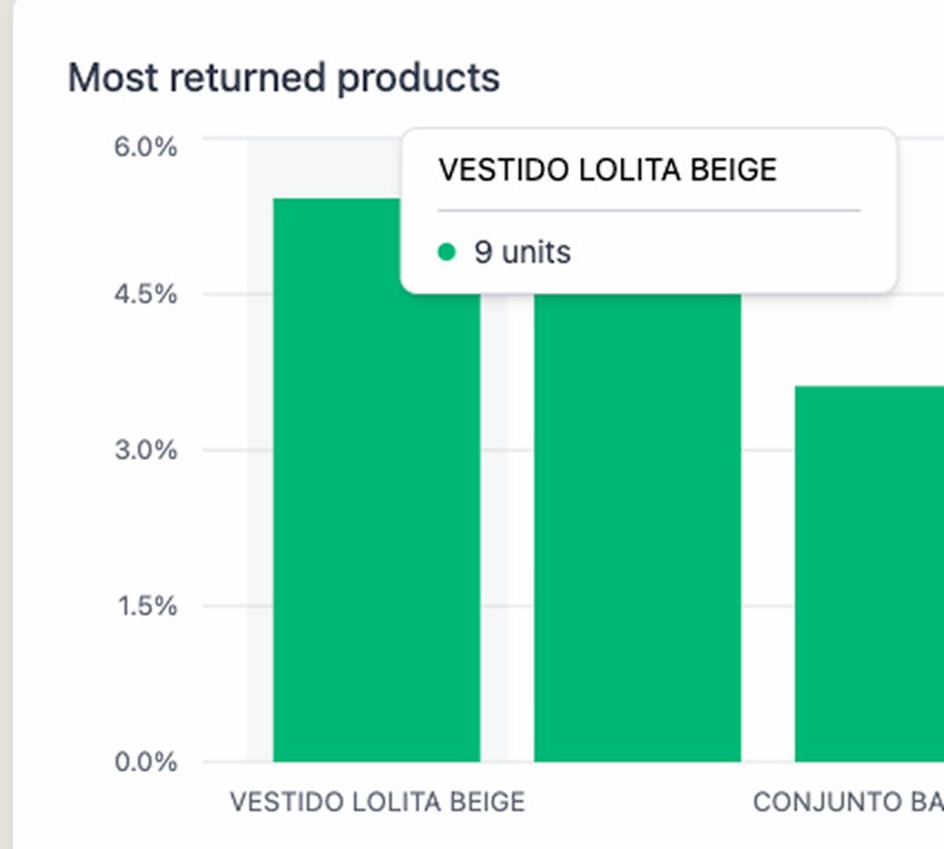
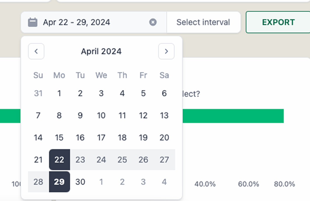
After launch, I iterated based on user feedback and analytics: bug fixes from the first release, improved graph interactions with hover-over tooltips showing exact return counts, and flexible time range filtering with a date picker for custom periods.
Product Communication
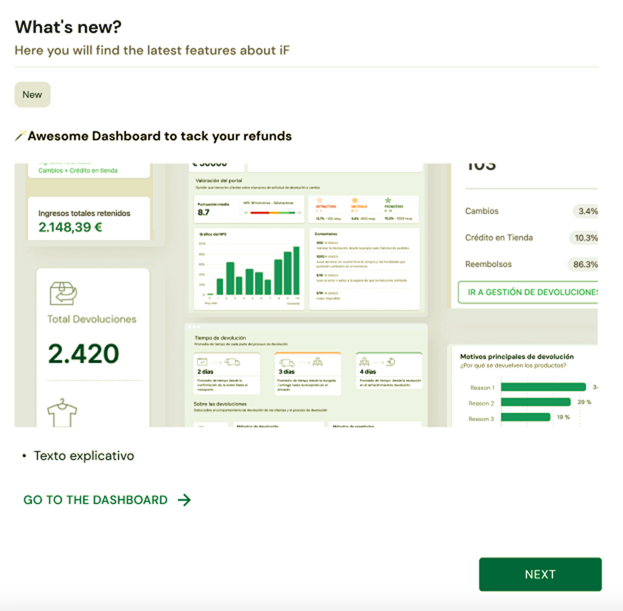
The first MVP was communicated through targeted emails to active brands, featuring a "What's new?" announcement with a visual preview of the dashboard and a direct link. A second dispatch targeted brands in the closing process, using the dashboard as a sales tool.
Reflection
The dashboard went from an 80% bounce rate to becoming the product's activation feature — the thing that made brands understand the value of the platform. The 18% reduction in Customer Success requests meant the team could focus on closing new clients instead of pulling CSV reports. And the 32% bounce rate reduction proved that when you show users data they actually need, they come back.
What made this project work was insisting on research in a company that had never done it. The hardest part wasn't designing the dashboards — it was convincing the team that building features based on stakeholder opinions wasn't enough.